Key Take Aways About Bloomberg Terminal Charting Tool
- The Bloomberg Terminal offers a versatile charting tool essential for interpreting market movements.
- Users can compare multiple data points/indicators on a single chart with customizable technical indicators.
- Common charts include line, bar, and candlestick, each suitable for different data analyses.
- Advanced features include a range of technical indicators, customizable overlays, and comparative charting.
- The tool aids in informed decision-making by providing context and insights, useful for traders of all levels.
- Real-life applications demonstrate its practicality, from stock analysis to Forex comparisons.
Unraveling the Basics of the Bloomberg Terminal Charting Tool
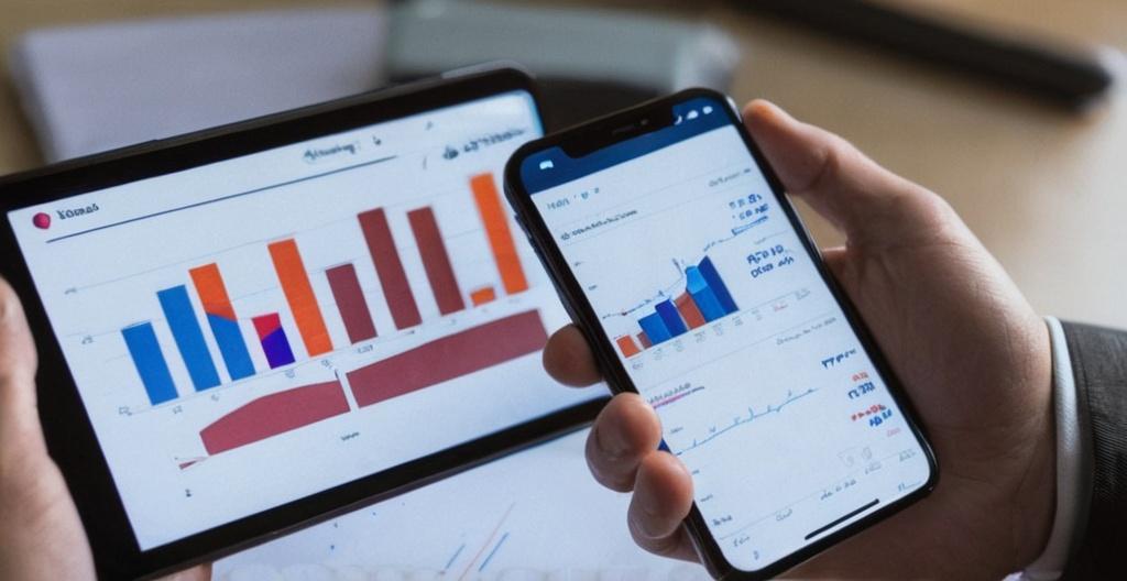
The Bloomberg Terminal, a powerhouse in the financial industry, offers an array of tools for traders and analysts. Among its extensive features, the charting tool stands out as an essential resource for anyone aiming to interpret market movements. While most traders are familiar with basic charts, the Bloomberg Terminal takes it up a notch with a multitude of options.
The charting tool on the Bloomberg Terminal allows users to juxtapose multiple data points and indicators on a single chart, a feature that’s particularly handy when analyzing market trends. No need to switch screens every two seconds when you can have everything you need on display. The tool comes packed with technical indicators that can be customized, letting you tailor your analysis without losing hair over settings.
Getting Handy with Basic Chart Types
Before getting into the nitty-gritty of the Bloomberg charting tool, it’s good to brush up on the different types of charts you can leverage. Among the most common are line, bar, and candlestick charts. Each has its benefits, dictated by personal preference and the data being scrutinized. For example, line charts are stellar for a quick overview, while candlestick charts are your best mate for seeing price movement details over time.
Line Charts: Simple Yet Effective
Line charts connect data points with a line, making it easy to follow the direction of a trend. Consider it your go-to when you want to capture the essence of data trends without too much clutter. Some folks might say they’re plain, but sometimes plain is perfect.
Bar Charts: Old School But Gold
Bar charts provide more information, such as opening, closing, high, and low prices. They are ideal for those who want to see more detail about how price values change over time. With these, you’re like the Sherlock Holmes of market analysis.
Candlestick Charts: The Traders’ Darling
Candlestick charts give a visual representation that many traders find easy to interpret. They highlight the price action in a way that’s accessible quickly—like snackable content but for trading.
An In-Depth Look at Advanced Features
Bloomberg’s charting tool isn’t all just pretty graphs. It’s a powerhouse of features that can significantly enhance your market analysis. Here are some of the standout features.
Technical Indicators Galore
From moving averages to RSI and MACD, Bloomberg’s charting tool offers a smorgasbord of technical indicators. This wealth of options can enrich your analysis and provide insights into market momentum, trends, and reversals. Want to see how overbought or oversold an asset is? No worries—it’s all here.
Customizable Overlays
With Bloomberg’s charting tool, adding overlays is a breeze. Whether you want a Bollinger Band or a moving average overlay, integrating these into your charts won’t have you breaking a sweat.
Comparative Features
Ever wanted to compare the performance of multiple stocks or indices side by side? Bloomberg’s comparative charting feature lets you do just that. This feature is particularly useful when analyzing correlations between different assets, helping you uncover hidden relationships that can be pivotal in decision-making.
Practical Applications: Case Studies and Examples
Let’s weave in some real-life applications of this tool. Suppose you’re tracking the S&P 500 and want to compare it with individual stocks. You can overlay the stock against the index and add technical indicators to see if the stock is outperforming or underperforming. This is where theory meets practice, and decisions take root.
In another instance, a trader might be focused on Forex pairs and want to compare the EUR/USD with the USD/JPY. Using the comparative feature alongside technical indicators, a comprehensive analysis can be conducted without switching between multiple charts.
Leveraging Bloomberg Terminal for Decision Making
The whole point of these tools is not just to paint pretty pictures, but to provide the insights necessary for making informed trading decisions. The Bloomberg Terminal does more than just present data; it gives traders context. From novice to seasoned pro, everyone can extract something valuable from the charting tool, regardless of their trading strategy. Its ability to synthesize and present data ensures that decisions are based on solid information rather than mere speculation.
Wrapping It Up
Bloomberg’s charting tool isn’t just a fancy option for the financially elite. It’s a versatile platform brimming with potential for anyone involved in trading. While some may argue it’s a bit of an overachiever, the depth and breadth of its functionality justify its standing. Whether you’re knee-deep in forex, equities, or commodities, this tool can offer insights that can sharpen your edge in the market.