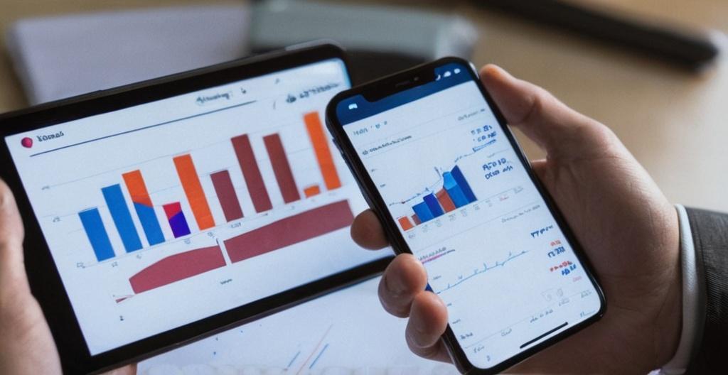
Key Take Aways About Bloomberg Terminal Charting Tool
- The Bloomberg Terminal Charting Tool transforms financial data into visual insights, easing trend analysis and market movements.
- Basic chart types include line, bar, candlestick, and moving averages.
- Advanced techniques feature Bollinger Bands and RSI for assessing volatility and price momentum.
- Highly customizable, allowing tailored visualization to suit trading strategies.
- Essential for fund managers and day traders; facilitates historical performance assessment and real-time decision-making.
- Challenges include a steep learning curve and high cost.

Introducing the Bloomberg Terminal Charting Tool
The Bloomberg Terminal, often referred to as the gold standard for financial professionals, isn’t just about streaming news and financial data. It’s got some nifty tools in its toolbox, one of which is the charting feature. This tool is where money people get to play with graphs and lines to see how their portfolios might shape up over time. So let’s dig into what makes this charting tool tick, shall we?
What’s the Big Deal with This Charting Tool?
Alright, picture this: You’re sipping your coffee, staring at your screen filled with numbers and tickers. Now, instead of just seeing those boring numbers, you get a visual treat with charts. The Bloomberg Terminal Charting Tool lets users visualize data, making it easier to spot trends, analyze market movements, and even make some educated guesses about the future. It’s like taking the red pill in the Matrix, but for finance nerds. You suddenly see everything, not just rows and columns of digits.
The Basics of Charting on Bloomberg
Now, if you’re just getting started, the tool offers simple line charts. Think of them as your training wheels. You plot two variables, maybe time and stock price, and there you go—a nice line that shows how your stock’s been performing. But that’s just the appetizer. The main course consists of bar charts, candlestick charts, and moving averages, setting the stage for more complex analysis.
- Line Charts: The vanilla option—plotting simple trends over time.
- Bar Charts: Useful for comparing different metrics side by side.
- Candlestick Charts: Popular amongst traders for its detail on price movements.
- Moving Averages: Ideal for smoothing out price data, giving you a clean arc to gaze upon.
Candlestick Charts: A Closer Look
If stock market charts had a celebrity, candlesticks would be it. Traders love ’em, mostly because they provide a snapshot of the open, high, low, and closing prices. They’re like the Swiss Army knife of charts. Each candle tells a story, kind of like reading a financial novel, letting you see the mood of the market in a glance.
Advanced Charting Techniques
Once the basics are in the bag, you’re ready for the advanced stuff. We’re talking Bollinger Bands, Relative Strength Index (RSI), and other jargon that sounds like a fancy tech startup but is actually just more ways to slice and dice data.
Relative Strength Index (RSI)
Now, RSI is the tool if you’re looking to measure the speed and change of price movements. It swings between 0-100, giving traders hints on overbought or oversold conditions. A high value suggests that the stock’s been makin’ gains and might be due for a breather. Conversely, a low number could mean it’s lagging, like a marathon runner on mile 20.
Bollinger Bands
Bollinger Bands aren’t just a cool name; they’re a way to measure volatility. Picture three lines on your chart—the middle one being a simple moving average, while the others are standard deviations above and below. When prices break through these bands, it’s like a market shock wave, triggering buy or sell signals.
The Art of Customization
Speaking of personal flair, the Bloomberg Terminal allows users to customize charts according to their trading strategies. Want to change the color of your trend lines? Go for it. Want to overlay multiple indicators? Knock yourself out. The customization options are quite flexible, ensuring that no two traders’ charts look exactly the same.
Real-World Applications
So, how do these charts play out in the real world? Well, let’s say you’re a fund manager analyzing the S&P 500. You’d use the charting tool to assess historical performance, compare it against other indices, and maybe even factor in geopolitical events. It’s like being an artist, but instead of a canvas, you’ve got financial data. Or maybe you’re a day trader who dabbles in forex. You’d rely heavily on real-time charting to make those split-second decisions. Spotting patterns, acting on trends, and maybe landing a home run trade—all thanks to these little lines and curves.
Limitations of the Tool
Despite its many features, the tool ain’t perfect. It requires a bit of a learning curve. Newbies might find it overwhelming, like trying to drink from a firehose. Then there’s the price. The Bloomberg Terminal doesn’t come cheap, so unless you’re serious about your finance game, it might be tough to justify the cost.
Conclusion
The Bloomberg Terminal Charting Tool is a big deal in finance circles, mostly because it turns raw data into visually comprehensible insights. While it has a learning curve and a price tag that might give you sticker shock, the ability to visualize and analyze complex data makes it an invaluable asset for those in the financial game. For those who can master it, it’s like having a financial oracle right at your fingertips.