Key Take Aways About Kagi Chart
- Kagi charts originated in Japan and focus on price over time, emphasizing market sentiment changes.
- Utilize lines that vary in thickness to indicate bullish (thick) or bearish (thin) trends.
- Benefit traders by filtering noise, offering trend clarity and psychological insights.
- Ideal for identifying trend reversals and support/resistance levels in volatile markets.
- Compared to candlestick charts, they provide a simplified view, focusing on significant price changes.
- Useful for traders seeking to enhance trend analysis techniques.
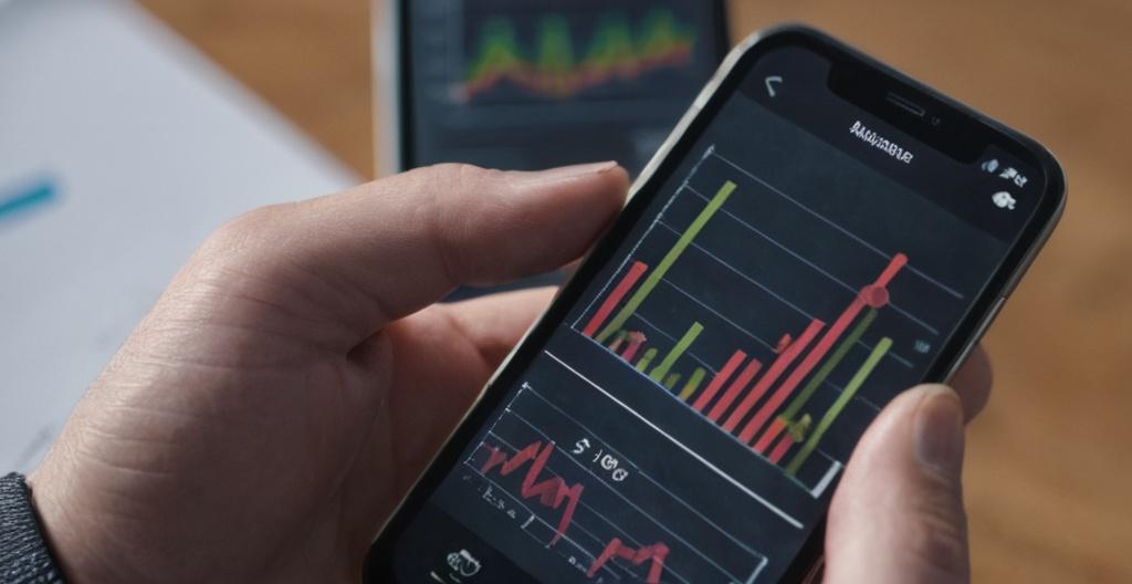
Introduction to Kagi Charts
Kagi charts, which originated in Japan, are an intriguing tool for traders interested in technical analysis. Unlike traditional charts that emphasize time, Kagi charts focus on price movements and changes in market sentiment. This makes them especially handy during periods of market volatility.
Understanding the Basics
Kagi charts are designed to highlight the price action by using lines that change direction based on price thresholds. The thickness and direction of the lines reflect the supply and demand dynamics of the market. These charts don’t worry about time intervals; instead, they concentrate on price changes, making them a unique addition to any trader’s toolkit.
The Mechanics of Kagi Charts
Kagi charts are built from a series of vertical lines that alternate between thin and thick, representing various price behaviors. These line thicknesses are altered based on price reversals, which are typically a predetermined percentage of the current price or a fixed amount. Here’s a quick rundown on how they work:
- Thick Lines: A thick or bold line indicates a bullish (buying) trend.
- Thin Lines: A thin line signals a bearish (selling) trend.
- Trend Reversal: A change in the line’s thickness indicates a reversal in the trend.
To better grasp this, consider that the reversal criterion of a Kagi chart can be adjusted according to trading needs. If you’re a trader who loves action-packed moments, you might prefer a smaller reversal criterion.
The Benefits and Uses of Kagi Charts
While traditional charts show every small movement, Kagi charts aim to filter out the noise, letting you focus on the overall trend. This offers several advantages for traders:
- Simplicity: With time out of the equation, Kagi charts provide a clearer view of market trends.
- Trend Identification: They’re excellent for identifying longer-term trends, as they emphasize the flow of the market.
- Psychological Insight: The chart’s design reflects market psychology, highlighting shifts between supply and demand.
Traders might find Kagi charts useful when exploring stocks with significant price movements. If your portfolio leans towards tech stocks, where volatility is a given, Kagi charts could become your go-to analysis tool.
Trading Strategies with Kagi Charts
Trading strategies using Kagi charts often revolve around recognizing trend reversals and support and resistance levels. Here’s how you can integrate Kagi charts into your trading strategies:
- Trend Following: Join the trend once a thick line appears, indicating bullish sentiment, and ride it until a reversal occurs.
- Reversal Trading: When a reversal is indicated by a change in line thickness, consider acting on it by entering a trade aligned with the new trend direction.
Consider the case of a trader spotting a thick line after a prolonged series of thin lines on a Kagi chart. This signals a shift to bullish sentiment, prompting an opportunity to buy.
How to Construct a Kagi Chart
Creating a Kagi chart involves a few straightforward steps. First, set the reversal criterion, which could be a fixed price movement or a percentage of the price. Next, plot the initial line, adjusting its direction and thickness based on subsequent price movements and the established criterion.
As you track the price, whenever the price moves by the reversal criterion, you reverse the line. If your Kagi line was thin and the price rose enough, the line becomes thick and vice versa. Keep an eye on these reversals as they provide crucial insights into market movements.
Comparing Kagi Charts to Other Charts
Compared to other charts, like candlestick or bar charts, Kagi charts offer a pared-down perspective on price action. While candlestick charts provide intricate details of price activity, including opening and closing prices, Kagi charts filter these details, focusing strictly on significant price reversals.
One might say Kagi charts wear blinders, ignoring time and small fluctuations to hone in on the larger market picture. So, if you’re looking to strip down the intricacies and home in on trendlines, these charts might be right up your alley.
Conclusion
Kagi charts’ unique approach of prioritizing price over time can be a breath of fresh air for traders swamped by the minutiae of traditional charts. Despite their simplicity, they pack a punch by offering clear insights into market trends and psychology. Whether you’re a seasoned trader or a newbie looking to broaden your analytical horizon, Kagi charts could be a valuable tool in your trading arsenal. And if you’re curious, why not give them a whirl on the next volatile stock you fancy?