
Understanding Financial Charts for Technical Analysis
Financial charts are the visual language of the market and learning how to understand and utilize them is strongly recommended. Price, volume, trends, volatility—it’s all there, packed into a few lines and bars. Whether you’re trading stocks, forex, cryptocurrency, commodities, or something else, the charts show you historical data that can give you clues about what might happen next.
Understanding financial charts doesn’t require a math degree or memorizing a hundred technical analysis indicators. You just need to know how data is plotted on charts, which patterns to look for in different situations, and how to correctly interpret what you see.
Technical Analysis
If you are interested in the field of technical analysis, get ready to see a lot of price charts, and also some that show volume. Not all charts display information the same way an different chart types can display and emphasize different things.
A basic historical price chart will show price over time. In most cases, the horizontal axis (x-axis) is time (seconds, minutes, days, months, or years, depending on your chart setting). The vertical axis (y-axis) is price. As price changes over time, the chart builds a visual pattern of those changes, by connecting each dot and drawing lines between them.
Below, we will look at some examples of common chart types you are likely to run into as you learn more about technical analysis. Each has its own strengths and weaknesses, and which one that is most useful depends on what you’re trying to do. Skilled technical analysts will often combine information from several different charts to get a fuller picture, turn down the noise, and make the important data stand out with more strength
Price Line Chart
What it shows: A line chart connects a series of prices over time. One price point per time period (usually the closing price) linked together to form a line.
Why traders use it: It’s clean. Great for long-term views or spotting big picture moves.
Keep in mind: It’s missing detail. You can’t see what happened during each period (highs, lows, price wicks, etc).
Good for:
- Long-term perspective
- Beginners wanting a simple view
- Identifying trend direction without clutter
OHLC Bar Chart
What it shows: Each bar represents a time period and shows the open, high, low, and close (OHLC) prices. A vertical line represents the range from low to high, with horizontal lines on either side showing the open (left) and close (right). The OHLC bar chart is a pillar of traditional technical analysis. These charts are less common now than in the past, but still used by old-school traders and technicians.
Why traders use it: You get more information from the OHLC chart than from a simple price line chart. This bar chart lets you analyze volatility and price structure clearly.
Downside: They take a bit of getting used to, compared to a simple price line chart.
Good for:
- Focusing on raw price data
- Analyzing volatility within each time period
Candlestick Chart
What it shows: Candlesticks display the same OHLC information as bar charts, but in a more visual, easier-to-read format. Each candle shows a body (between open and close) and wicks (high and low). If the close is higher than the open, the candle is typically displayed in green or white on the screen. If lower, it’s red or black.
Why traders use it: Candlestick charts are the default for most technical traders nowadays. These charts can be interpreted quickly, they are good for spotting patterns, and they give clear signals on buying or selling pressure. A few candles can tell you a lot about who’s in control: buyers or sellers.
Good for:
- All types of traders
- Spotting reversals or continuation setups
- Reading market sentiment
Heikin Ashi Chart
What it shows: This is a modified candlestick chart. It averages price data to smooth out the appearance of trends.
Heikin Ashi candles use formulas to reduce noise:
- Open = average of previous candle’s open and close
- Close = average of current open, high, low, close
Why traders use it: Heikin Ashi filters out minor pullbacks, making trends look cleaner.
Downside: While it is easier to see when a trend starts or ends, you lose precise price levels. The candles won’t show exact highs/lows the same way as regular charts.
Good for:
- Trend traders
- Traders who want less noise
- Swing and position trading
The name Heikin Ashi comes from the Japanese language, where heikin means ”average” or ”mean”, and ashi signifies ”foot”. In a trading context, this ”foot” is a candle or bar. So, heikin ashi essentially means ”average bar” or ”average candle”. It is a good name, because with a heikin ashi chart, each candlestick is derived from averaged price data, instead of raw open/high/low/close prices. This makes the chart smoother and helps filter some of the noise. While regular candlestick patterns show price action at each time interval, heikin ashi works differently, and will therefore reduce ”market choppiness” and help make trends more easy to spot. The downside is that we lose some accuracy and responsiveness.
Heikin ashi is based on the Japanese candlestick charting techniques developed in Osaka by the 18th century rice trader Munehisa Homma.
This is how we calculate each candle:
- Close = (Open + High + Low + Close) / 4
- Open = (Previous Heikin Ashi Open + Previous Heikin Ashi Close) / 2
- High = Max(High, Heikin Ashi Open, Heikin Ashi Close)
- Low = Min(Low, Heikin Ashi Open, Heikin Ashi Close)
Heikin ashi is a so-called smoothed series, as current values depend on previous candles.
Interpretation:
- Long bearish candles lacking the upper wick signal a strong downtrend.
- Long bullish candles lacking the lower wick signal a strong uptrend.
- Small-bodied candles with two wicks signal a possible reversal or consolidation.
Before you attempt to use heikin ashi charts, it is important to remember that because of the averaging, this type of chart reacts especially slow to price changes. There will be significant lag, which must be taken into account. Also, the candle´s open/close is not the true market open/close. Do not use heikin ashi charts for scalping or other techniques where exact timing is essential, or for strategies where you must be able to see gaps and true high/low price information.
With that said, heikin ashi charts can be great when you need to filter out minor fluctuations such as fakeouts and whipsaws. The trends will be easier to identify than with a standard candle chart, and heikin ashi is known to help traders avoid premature exits. Heikin ashi works best in trending markets. Ideally combine with volume for confirmation.
Renko Chart
What it shows: Renko charts are built using price movement, not time. A new “brick” is added only when the price moves a set amount (e.g. $1 or 50 pips). If price doesn’t move far enough, no new brick is printed.
Why traders use it: Renko filters out sideways noise and only shows meaningful price movement. There are no time-based candles, just directional bricks. Great for trend analysis.
Downside: This chart is not good for timing entries precisely.
Good for:
- Traders wanting clean trends
- Filtering out choppy markets
- Avoiding fake signals in low-volatility conditions
Just like the heikin ashi charts, the renko charts have their roots in Japan. The name renko comes from the Japanese work renga, which means brick. Unlike heikin ashi charts, renko charts are completely price-based. Instead of marking the price for each time interval, the renko chart will only draw a brick when the price has moved by a pre-defined amount (the brick size). It doesn´t matter how long it takes to reach the pre-defined amount. If a trend is super strong and the price is sky rocketing or falling like a rock, the bricks can be slammed down at super speed. In an enormously slow market, it might take days before you get to see a new brick.
Each new brick is always plotted at a 45 degree angle from the previous one. It will be up for rising prices, and down for falling prices.
You are in charge of deciding the brick size, and it can for instance a fixed price amount (e.g. a $5 dollar move) or a percentage of the asset´s price (e.g. 1%). For dynamic scaling, you can chose the brick size based on the Average True Range (ATR).
The renko chart helps reduce noise by filtering out chop. Trends look clean, and both support /resistance levels and breakout levels are easier to spot. For this, you give up the ability to see how long a move took. It can also take a while before you learn which brick sizes that work best in different conditions. If you make the brick size too small, a lot of noise will get in. If you make it to big, the chart can become to blunt to be useful for your strategy.
Tick Chart
What it shows: Each bar or candle in a tick chart is formed after a set number of trades rather than time. For example, a 100-tick chart creates a new bar every 100 trades.
Why traders use it:Tick charts adjust with activity. More trades mean more bars. They’re great for fast markets and scalpers who need to see market flow in real time.
Keep in mind: Not all platforms offer them, and they can be processor-heavy.
Good for:
- Day traders, especially scalpers
- High-frequency trading environments
- Seeing market flow during busy sessions
Range Bar Chart
What it shows: Like Renko, range bar charts are based on price movement. In a range bar chart, each bar covers a specific price range, and time is not a factor. If the range isn’t filled, no new bar is created.
Why traders use it: It standardizes the visual appearance of movement. Every bar shows a consistent price move, which makes patterns and breakouts easier to spot, and this is appealing when you are more concerned about momentum than time.
Good for:
- Momentum traders
- Price action scalpers
- Reducing time-based distortion
Point and Figure Chart
What it shows: No time, no volume, no candles. Just Xs (price up) and Os (price down), plotted based on predefined box size and reversal rules. The price must move a certain amount before a new mark is added.
Why traders use it: Pure price charting. It strips away everything and focuses only on price direction. It’s not common in most modern platforms, but is still used by technical purists.
Good for:
- Long-term price analysis
- Pattern-based traders
- Cutting out all market noise
What Financial Charts Show
Most financial charts are price-focused, and will show you the story of the price over a certain period of time. They’re visual tools that map out how the price of an asset (like a stock, currency, commodity, or cryptocurrency) has moved over time. They turn raw price and time data into something that makes it easier to spot patterns for many of us. Instead of staring at a list of numbers, you get a visual pattern, and patterns help traders and investors make decisions.
It is important that keep in mind that charts do not show you why something is happening, they will only show that something is happening. A price drop could be profit-taking, news, manipulation, macro conditions, or all of the above. The chart just reflects the final result: the price. Charts do not guarantee anything. Patterns fail, trends break, fakeouts happen. A chart gives clues, not certainty. It’s a tool, not a magical crystal ball.
Key Elements on a Chart
On a standard price chart, the x-axis (horizontal) is time. The interval could be one minute, one hour, one day, one week, or any timeframe you’re working with. The y-axis (vertical) is price. As the price moves up and down over time, the chart maps that movement. You’re not just seeing numbers, you’re seeing how the price reacts, where momentum builds, where buyers step in, where sellers take control, and where previous moves repeat or not.
Many charts used for technical analysis show four key prices for each time period:
- Open – Where the price was at the start of the period
- High – The highest price reached during the period
- Low – The lowest price during the period
- Close – Where the price ended at the end of the period
In other words, they show the OHLC (Open, High, Low, Close) points. This information can be displayed in various ways, e.g. using bars, candles, or other chart types.
Volume
Volume isn’t always shown on charts, but when it is, it helps confirm whether a move matters or not. Volume shows how many units of the asset that were traded in each time period. It’s often shown as a histogram below the chart. Volume tells you how active the market was.
- Rising volume confirms strength
- Weak volume might suggest a lack of conviction
Trends
One of the most important things a chart shows is trend direction. Are prices going up, down, or sideways? Charts make trends easier to see, compared to just looking at the raw numbers.
- Uptrend – Series of higher highs and higher lows
- Downtrend – Series of lower highs and lower lows
- Range – Prices bounce between a ceiling (resistance) and a floor (support)
Support and Resistance
These are price levels where buying or selling pressure often appears.
- A support level is where buyers who have been waiting for the price to drop typically enter, keeping the price from falling further. The buying pressure is strong enough to overcome selling pressure, preventing the price from dropping below the support level.
- Resistance level is a price point on a chart where a security’s price has historically faced difficulty rising past, acting as a “ceiling” that prevents further price increases. It’s a level where selling pressure is typically strong enough to overcome buying pressure, causing the price to reverse or stall.
Charts make it easier to spot these levels. If price keeps bouncing at a certain level, that’s a key zone to watch.
Reversals and Continuations
Charts can help identify when a trend is losing strength or getting ready to continue. You can spot reversal patterns, breakout setups, or signs of exhaustion. These aren’t guarantees, they’re only clues and indications. A double top might for instance suggest, but not guarantee, a reversal from uptrend to downtrend. A flag pattern could signal a pause before the next leg of the trend continues, but it should be interpreted in conjunction with other clues.
What is a double top? A double top is bearish reversal pattern that forms after an uptrend. When you spot it, it is a clue indicating that the price might be about to shift to a downtrend. The double top is two consecutive peaks (the tops) at roughly the same price level, separated by a trough. The bottom of the trough (the neckline) is a support level. What has happened to cause this pattern? The price was trending upward. It reached a high point, and then fell down a bit. The price then rallied once more, but as soon as it had reached roughly the same height as the previous peak, it began to fall again.
What is a flag pattern? This pattern resembles a flag on a flagpole. It is created by a sharp price movement (which forms the pole) followed by a period of consolidation (which forms the flag). The flagpole is a strong, almost vertical price movement. It can be either upwards (bullish flag) or downwards (bearish flag). During the consolidation period, the price moves within a narrow range. This range forms the actual flag (not the pole). Flag patterns usually form over a few days to a few weeks. Technical analysis traders chiefly look for flags to spot and anticipate trend continuation.
Chart Patterns and How to Use Them
Chart patterns are certain shapes formed by price movement on a chart. They show how buyers and sellers have behaved. These patterns help traders identify potential turning points, continuation zones, or areas where momentum is building. Patterns don’t guarantee what comes next, but they can help you make educated decisions based on what the market is already doing. Chart patterns won’t tell the future, but they’ll show where traders are paying attention.
Patterns give structure to price action and can help traders in various ways, e.g. when it come to:
- Identifying high-probability entry and exit points
- Spotting early signs of a breakout or reversal
- Setting clear stop-loss and take-profit zones
- Understanding market psychology, e.g. fear, greed, hesitation
Reversal Patterns and Continuation Patterns
The two main categories are reversal patterns and continuation patterns. Reversal patterns signal that a trend may be ending. Continuation patterns suggest that it’s just taking a breather before continuing in the same direction.
Reversal Patterns
These patterns hint that the current trend might be running out of steam and that price may be about to change direction.
Head and Shoulders
- Appears after an uptrend
- Looks like a peak (head) between two smaller peaks (shoulders)
- Signals a shift from bullish to bearish
- The “neckline” is the key level. If the price breaks it, the trend often reverses.
Inverse Head and Shoulders
- Same as above, but upside-down
- Appears at market bottoms
- Signals bearish-to-bullish reversal
Double Top
- The price tests a resistance level twice and fails. You can expect a bearish reversal. (A triple top has three tops instead. This means more confirmation. This patterns is often slower to form.)
Double bottom
- The price tests a support level twice and holds. You can expect a bullish reversal.( A triple bottom has three bottoms instead. This means more confirmation. This patterns is often slower to form.)
Continuation Patterns
Continuation patterns suggest that a trend is just pausing and will soon resume in the same direction as before.
Flags
- The price makes a sharp move, then consolidates in a tight, sloping channel
- The breakout is usually in the same direction as the initial move
- Bull flags = uptrend pause. Bear flags = downtrend pause
Pennants
- Like flags, but shaped like a triangle
- Form after a strong price move
- Tightens into a small triangle before a breakout
- Less directional bias until breakout confirms
Triangles
- Ascending triangle. This triangle has a flat top and rising lows. Usually breaks upward.
- Descending triangle. Has a flat bottom and falling highs. Usually breaks downward.
- Symmetrical triangle. Both sides squeezing together. Wait for breakout.
Rectangles
- The price bounces between support and resistance, forming a horizontal consolidation box pattern on the chart.
- Breaks out once enough pressure builds
- Direction follows the breakout
Indicators
You don’t need indicators to read a chart, but they can help. Just don’t overload your screen. We suggest you start simple, e.g. by learning how to use Moving Averages, RSI, MACD, and Bollinger Bands.
- Moving Averages (MAs) show average price over time and are useful for identifying trend direction (upward, downward, sideways). They are trend indicators. (Other examples of trend indicators are Trendlines and Ichimokyu Cloud.)
- The Moving Average Convergence Divergence (MACD) indicator shows trend strength and momentum shifts. It is a momentum indicator. (Another example of a momentum indicator is the Stochastic Oscillator.)
- The Relative Strength Index (RSI) measures overbought/oversold levels. It is used for momentum analysis. Together with the MACD, it can help you gauge the strength and speed of the price movements. It is a momentum indicator.
- Bollinger Bands show volatility and potential mean reversion zones. They can help you spot potentially overbought or oversold conditions. Another example of a volatility indicator is the Average True Range (ATR).
Start with just one or two, and make sure you really know what they are, how they behave, and how they can be useful for your strategy. If you need a volume indicator, you can for instance use On-Balance Volume (OBV) or Accumulation/Distribution Line.
In technical analysis, indicators are calculations based on historical price and volume data. Traders use indicators to analyze trends and momentum, and understand potential buy/sell signals. Indicators are not used in isolation: they are tools that can be helpful when you need to confirm a trend, estimate a support or resistance level, or identify a pattern correctly.
In essence, indicators are mathematical formulas that we apply to market data. The result is a series of data points, which can be plotted on the chart and help you identify trading opportunities – or realize that a seemingly promising opportunity is actually way to weak or contradictory for you to act on.
Tips for Using Patterns in Trading
Have Patience and Wait for the Break
Patterns are only setups; they’re not signals until the price breaks out. If you act before confirmation, you’re guessing. Let the market prove it’s ready to move. Example: In a head and shoulders pattern, don’t go short just because the right shoulder forms. Wait for the price to break below the neckline. That’s confirmation.
Combine Price Movements With Volume
Volume adds credibility. A breakout with high volume usually has more force behind it, while a pattern that breaks on weak volume is more likely to fizzle out.
Set Clear Entries and Stops
Every patterns gives you natural levels to work with. A common technique is to enter just after the break out, put the stop-loss on the other side of the pattern, and obtain the target by measuring the height of the pattern and project it from the breakout point. Example: If a double bottom forms at $100 and peaks at $110, the “height” is $10. A confirmed breakout above $110 could target $120.
Don’t Force It
Not every price move forms a perfect pattern. Sometimes price just runs. Sometimes it chops around and does nothing. If you don’t see a clean structure, don’t try to force one. Patterns are only useful if they’re clear.
Common Mistakes
- Acting too early
It can be very tempting to enter before the breakout, hoping it works out. Greed makes you want to enter as early as possible, because you do not want to ”waste any profit” waiting. - Ignoring volume A breakout without volume is suspect. Always analyze the price movements in conjunction with the volume.
- Forcing a pattern
If you want it bad enough, you will start seeing shapes where none really exist. The human brain is great at spotting patterns; so great that we have a tendency to believe we see them even in truly random noise if we pay enough attention. - Ignoring trend Reversal patterns in strong trends often fail, and you need to keep this in mind.
- Overtrading Not every pattern needs to be traded. Pick the ones with clean structure and strong confirmation. Only carry out trades that fit your overall trading strategy and risk management rules. Excellent set-ups are worth the extra wait. Do not trade just because you are bored or greedy.
The Chart Is Not A Magic Crystal Ball, And Neither Are the Indicators
As we have mentioned before, the chart is not magic and it can not tell the future, and this is true for indicators as well. Charts and indicators tell you what has already happened, and that information can be helpful when you are making decisions about the future. When properly used, the visualized data gives context, and shows where others are likely to react, where price has failed before, and how strong the current movement is. Focus on recognizing when the odds shift, when risk is worth taking, and when price confirms what you were waiting for.
Learning How to Analyze Financial Charts
Technical analysis involves displaying price movement visually using charts, which makes it easier to spot trade opportunities, and also spotting when it might be better not to trade. It’s not about predicting the future with magic patterns. It’s about learning how price commonly behaves, where traders are more likely to react. Markets have a tendency to repeat the same patterns again and again, but getting the timing right is notoriously tricky, even for skilled and experienced traders.
Learning how to analyze charts and employing technical analysis takes time, but it’s completely learnable if you start from the beginning and focus on a few key things: price, trend, structure, and repetition. You don’t need 10 exotic indicators and an expensive paid course sold by a TikTok influencer. You need study time, screen time, observation, and a bit of structure to your learning.
Chart basics
- On a normal price chart, you will have time on the x-axis (the horizontal axis) and price on the y-axis (the vertical axis). In other words, the x-axis shows when and the y-axis shows how much.
- Each bar or candle will represent one unit of time. How long that is depends on the timeframe for this particular chart. It can for instance be 1 minute, 1 hour, or 1 day.
- You can use a candlestick chart or a bar chart to visualize open prices, high prices, low prices, and close prices on the same chart.
Price Action
Before you can become a good technical analyst, you need to be truly familiar with watching price movements on a chart and understanding what you see. Forget indicators and other advanced elements right now, and just focus on the price and how it moves. What is it doing at this chart?
- Is it going up, down, or sideways?
- Are highs getting higher? Are lows getting lower?
- Does the price break past old levels or reject them?
- What happens at obvious price levels?
Watch how the price reacts at certain zones. Watch how it behaves during slow periods versus fast ones. Look at what happens after a strong move; does the price consolidate, reverse, or continue?
Structure
Markets have structure and price has a tendency to flow in patterns. Here are a few concepts that you need to understand.
- Trends – Higher highs and lows in an uptrend, lower highs and lows in a downtrend
- Ranges – Price stuck between support and resistance, bouncing back and forth
- Breakouts – Price finally moves out of a range or through a level with momentum
- Pullbacks – Temporary move against the trend before it resumes
Get used to spotting these and recognize when price is pushing, pausing, or failing.
Support and Resistance
Support is where price stops falling. Resistance is where it stops rising. These are zones (not exact price points) where traders often react. Support and resistance levels often form based on previous highs, lows, consolidations, or sharp reversals.
Draw horizontal lines on your chart to mark where price reacted multiple times. Then watch what happens when the price gets close to that zone again. Does it bounce, stall, or break through?
Pick a Timeframe and Stick to It Until You Really Get It
When we are in the process of learning, it is easy to fall into the trap of bouncing back and forth between so many options that we end up dizzy and confused instead of actually developing any deeper understanding of the subject matter. We suggest your start with one or two time frames and really study them, before you proceed. If your strategy is swing trading, 4-hour charts and daily charts are a good starting point for a beginner. If you are into intraday trading, 15-minute and 1-hour charts will work well. Stick to your chosen view and train your brain to spot patterns in that rhythm. Lower timeframes move fast and have more noise. Higher timeframes move slower and have cleaner structure. They each require different mindsets.
Watch Real Charts
There is no substitute for eyes on charts. You won’t learn chart analysis simply by reading about it or memorizing the underlying principles. You need to devote both time and energy to watch a lot of charts, live, in real time. Pick one market (e.g. EUR/USD or S&P 500) and watch it daily. Mark key levels. Note how price reacts around those areas. Screenshot your observations. At the end of the day, check what played out. Keep a log. How correct are you in your predictions, over time? The idea is to build visual memories for how price moves. Over time, you’ll see patterns automatically.
Learn to Use One or Two Indicators (Later)
Once you can read price and structure clearly, you can add a tool or two, such as Moving Averages for trend direction, RSI and MACD for momentum or overbought/oversold conditions, and at least one volume indicator to confirm strength of breakouts or rejections. Use them to see if they support or weaken your view. They should not be used alone.
Indicators can be very useful, but they all come with their own weak spots, and it is important to take this into account. Misunderstanding and misapplying indicators is a very common mistake among novice technical traders, who become over-reliant on indicators and start ignoring raw price action and order flow. Do not forget that indicators rely on historical price data and will lag behind actual price movements. Also, indicators that work well in trending markets can run into serious difficulties if you try to use them when markets are choppy or moving sideways.
As you start learning more indicators, you will see that many of them are based on similar math, such as price averages. Using several of these indicators together can give the illusion of confirmation, when they are actually just showing the same thing because they are based on the same foundation.
Backtesting
Pick a time in the past on the chart and scroll forward slowly, bar by bar. Watch how price unfolds. Mark what you would do at each point. Would you buy here? Where would your stop-loss go? Where would you put the take-profit order? Did the trend continue or reverse? This builds trading instinct without risking money.
The next step is to open a free Demo Account with a broker. Make sure it is filled with free play money, and use it to engage in mock trades to see how your analysis stacks up against real market data. Treat the demo account seriously. You want to instill healthy trading practices, not fool around and get used to bad and reckless trading habits.
Take screenshots of trades, both good and bad. Write notes on what the chart looked like before and after. What did you miss? What worked? What felt obvious later but not in real time? You can also learn by studying charts from more experienced traders, but stay away from ones that only publish their charts because they want to sell get-rich-quick schemes.
Keep It Boring
Don’t chase weird indicators or rare candlestick names. The basics work:
- Trend
- Structure
- Levels
- Momentum
- Risk and timing
So may of the traders who last 10+ years are using the same handful of setups over and over. They don’t reinvent the wheel or purchase a ”get-rich-quick system” from some scammer. They just get very good at reading charts and understanding when price movements are giving them an edge
Learning to analyze charts is a lot about seeing the same things happen often enough that you stop reacting emotionally and start making logical decisions. Start small. Focus on one chart, one timeframe, and a few simple ideas. Track what you see. Screenshot it. Practice reading price over and over again. Don’t worry about calling tops or bottoms. Learn to read the middle, and trade what the market is actually showing you, not what you wish it would do.
Who Uses Financial Charts?
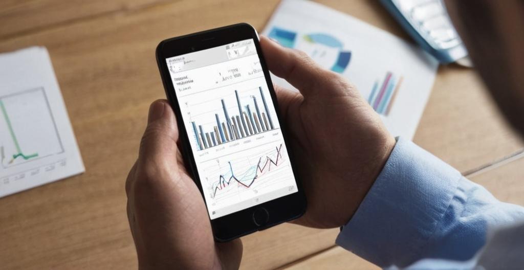
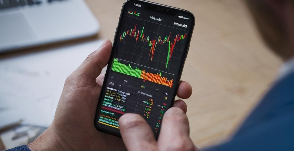
Financial charts aren’t just for full-time traders or investment professionals, they’re used by almost anyone making decisions about buying or selling financial assets. Whether you’re trading forex on a laptop, analyzing cryptocurrency on your phone, or managing a retirement portfolio, charts are a go-to tool for seeing what the market’s actually doing.
Charts are essential for short-term traders like day traders and swing traders, but they’re also widely used by long-term investors, analysts, brokers, and even casual retail traders. Each group uses charts differently depending on their goals, timeframes, and risk tolerance. Anyone who needs to make a decision about price, whether for minutes or years, can use financial charts. From day traders glued to 5-minute setups and swing traders waiting for breakouts, to long-term investors avoiding buying at market highs. Charts are the visual foundation of modern trading.
Some traders rely very heavily on technical analysis, and it is their main tool for making forecasts and recommendations. Some of them are hobby traders, but there are also plenty of technical analysts that work for investment banks, trading firms, or serve as independent advisors. They can use a wide range of chart types and indicators to analyze market structure, volume, and price behavior, and provide reports or trade signals based on visual setups.
Day Traders
Day traders tend to rely very heavily on technical analysis and are often glued to their charts during the trading session. They buy and sell within the same day, rely heavily on live price data and fast-changing chart patterns to find short-term setups. For practical tools, live analysis, and platform comparisons geared toward active intraday traders, DayTrading.com is a relevant resource.
- Day traders often use 1-minute, 5-minute, and 15-minute charts.
- They look for small price movements to ride within the trading session.
- There is often a focus on momentum, breakouts, and volatility.
- Day traders often combine chart patterns with volume data. Sometimes, taking real-time news into account is also necessary.
Swing Traders
Swing traders typically hold trades for a few days to a few weeks. They use charts to spot short- to mid-term trends and reversals, trying to catch the “swings” between highs and lows. Swing trading is less intense than day trading, but still chart-driven. Charts help swing traders find optimal entries and exits. They’re not chasing every move, and they want clean setups with room to run.
- Swing traders often use 4-hour, daily, and weekly charts.
- There is often a focus on patterns like flags, breakouts, or double bottoms.
- Successful swing traders often combine technical indicators with broader market context.
Long-Term Investors
Even long-term investors (people holding positions for months or years) use financial charts, though they tend to zoom way out and stick to the longer timeframes. Charts can help long-term investors avoid buying into hype at the top or selling into fear at the bottom. Even Warren Buffet will not buy shares without understanding price history.
- Investors tend to use weekly, monthly and even yearly charts.
- Charts can help an investor spot major trends or long-term support/resistance zones.
- Charts can be helpful when you need to confirm fundamental decisions with visual price trends. . For UK-based investors looking to apply long-term chart strategies to broader investment planning, investing.co.uk offers guides and data-driven insights.
- Charts can help you avoid bad entries by waiting for pullbacks.
A subset of the long-term investors are the professional portfolio managers. For long-term portfolios they tend to focus on fundamentals, but they still check charts to time entries and manage risk. They can for instance use charts to avoid bad timing when allocating capital, watch for price levels that may trigger institutional buying/selling, monitor performance and volatility visually, and combine technical analysis with macro and sector outlooks to paint a fuller picture. They’re not trying to jump on short-term movement, but they use charts to protect capital and avoid obvious traps.
Can cryptocurrency traders use technical analysis?
Yes, cryptocurrency traders can and do use technical analysis, in a manner very similar to how forex traders use it. Cryptocurrency traders, especially retail ones, often learn technical analysis first before learning anything else. Because most crypto coins don’t have fundamentals, price is often the only real signal available. There is no national bank adjusting interest rates and no government releasing economic data. Many crypto traders use trading platforms like TradingView or Binance, which are built around chart-based trading. Charts can be used to find patterns that repeat across different coins, or for just one specific coin.
Understanding the background
Technical analysis can easily feel very modern and high tech, but it has actually been around for quite some time. In Europe, foundations of technical analysis can be found in the Amsterdam-based merchant Joseph de la Vega’s accounts of the Dutch financial markets in the 1600s. In Asia, technical analysis dates back to the 1700s, when the rice merchant Munehisa Honma developed early candlestick techniques for trading on the Dojima Rice Exchange in Osaka during the Tokugawa Shogunate. In North America, the 19th century journalist Charles Dow (of Dow Jones fame) developed a series of principles for understanding and analyzing market behavior, which later became known as Dow theory, and contributed greatly to technical analysis as we know it today.
Important steps that would help bring technical analysis into the mainstream were taken in the 1920s and 1930s, when Richard W. Schabacker wrote several books that continued the work of Charles Dow and the Dow Theory-proponent William Peter Hamilton. You might for instance want to check out ”Stock Market Theory and Practice” and ”Technical Market Analysis” by Schabacker.
A few years after the end of World War II, Rober D. Edwards and Hohn Magee published ”Technical Analysis of Stock Trends”, a book exclusively concerned with trend analysis and chart patterns. Despite being over 75 years old now, it is still relevant and widely read by traders.
Eventually, Paul V. Azzopardi combined technical analysis with behavioral finance to coin the term ”Behavioral Technical Analysis”. Other notable scholars of the 20th century are Ralph Nelson Elliott, William Delbert Gann, and Richard Wyckoff, who all developed their own respective trading techniques.